Data Gifs
April 9, 2015
Tags:
Communication
Design
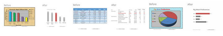
The folks over at Dark Horse Analytics have just added another explanatory animated gif, this time tackling the humble pie chart. Here are all three gifs, which show how to make your charts and tables much more awesome (and understandable!) in a few simple steps. A few design principles CAN go a long way.
Tables
![]()
Bar Charts

Pie Charts