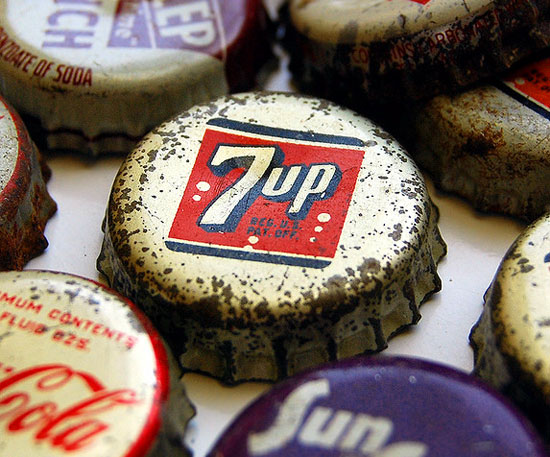
Pop Experiments

I drink a lot of soda. Maybe not as much as this woman (let it be a warning!!), but still, Diet Mountain Dew is a substantial part of my daily liquid intake. So of course I was intrigued when I ran across this dataset on soda consumption since the 1950's (it actually inclues all beverages, but one track mind here). I decided to make an interactive chart out of this very significant information.
I had just learned how to use FasterCSV and a little Ruby to turn a .csv file into a bar graph, so I used the same approach. Basically I ended up creating a bunch of little divs, their heights calculated as percentages of the total height of the container div. Also learned about jQuery .prepend method, which let me attach labels — the gallons of soda per person — to each bar. Here it is!
